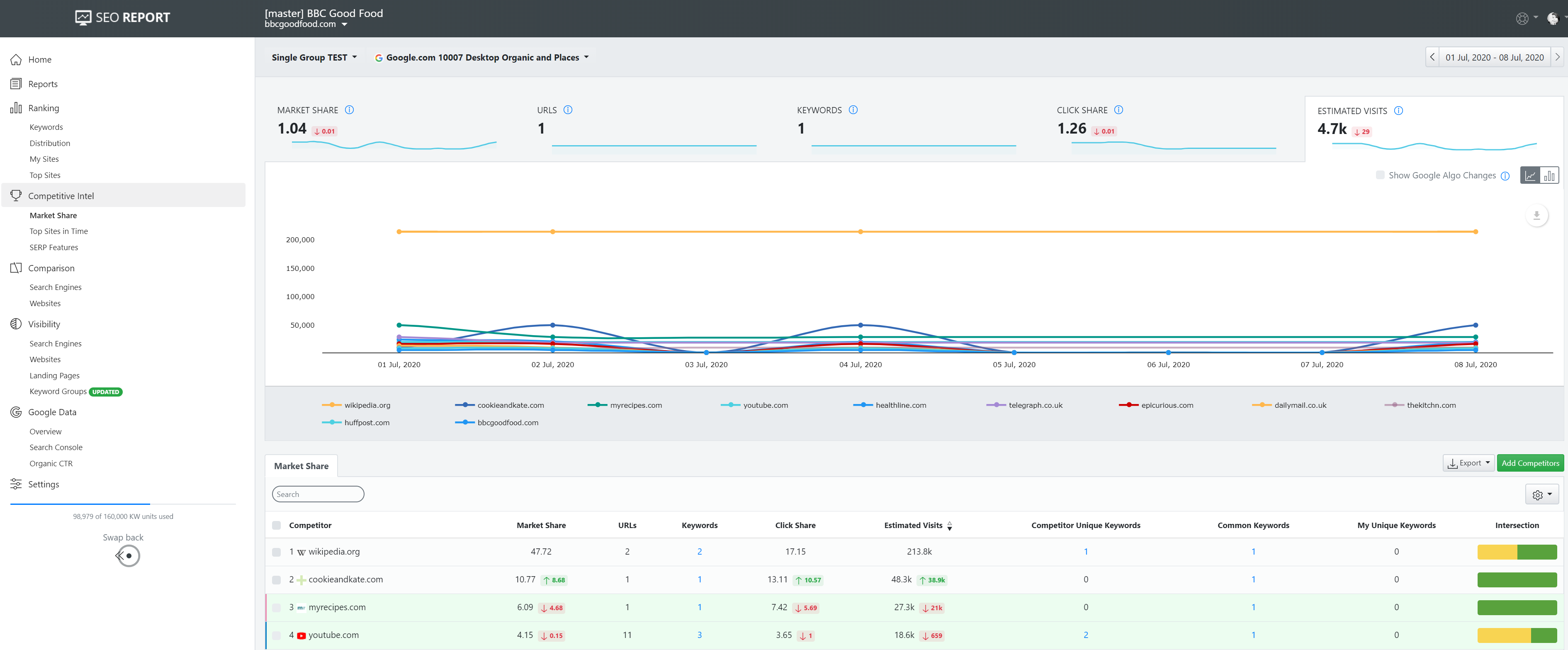
We are excited to share our progress with the latest update of the Advanced Web Ranking interface.
A more condensed, cleaner, and lighter look, will make it easier to slide through the tasks you are focusing on.
Here's what we changed:
- Rearranged the top bar, now combining the logo section and projects list drop-down
- The date picker moved up to the inputs bar, on the right, becoming a static component in all reports
- Merged exporting options under one button
- New "add" inputs button, so you maintain focus on the report you're at
- Added visual tabs for sliding through the available display views of the same UI section
- Redesigned the table settings button and moved it to the right-hand side
- Added sticky elements, such as the inputs bar, date picker & table header, to work easier with large datasets or sophisticated dashboards.
Plus, there are a bunch of other minor changes designed to improve your workflow.
